
A study into visuals by the University of Alabama demonstrated that clear images do not only reinforce messages and clarify content, but improve someone’s ability to comprehend information. Using a group of students and monitoring how well they absorbed and understood information in different scenarios, the researchers found that the groups presented with visual aids performed better. The way in which students were presented information was broken down into three forms: verbal only, visual only and verbal and visual.
Analyzing retention rates after three hours, the scientists found that a combination of verbal and visual stimuli resulted in retention rates almost 15% greater than visual alone. Moreover, after three days, the difference between visual only and verbal + visual was a staggering 55%.
Applying these findings to the world of web design clearly shows that visual information is extremely important to the way humans understand and process information. The right visual layout can create a more memorable user experience which, in turn, leads to greater visitor return rates.
It’s All About Space
Source: www.wikia.com
One of the most important techniques the savvy web designer can employ when putting together their next project is space. The main reason space has become such a key component of visual layout in web design over the last few years is that it helps improve navigation and readability.
In line with the research from Alabama University, visual stimuli lead to more effective rates of mental retention and the best way to make images (which can include pictures or blocks of text) more impactful is to allow for enough space between them. A skilled web designer will use the minimum amount of images possible and ensure that they are arranged in a logical order, leaving negative space between them.
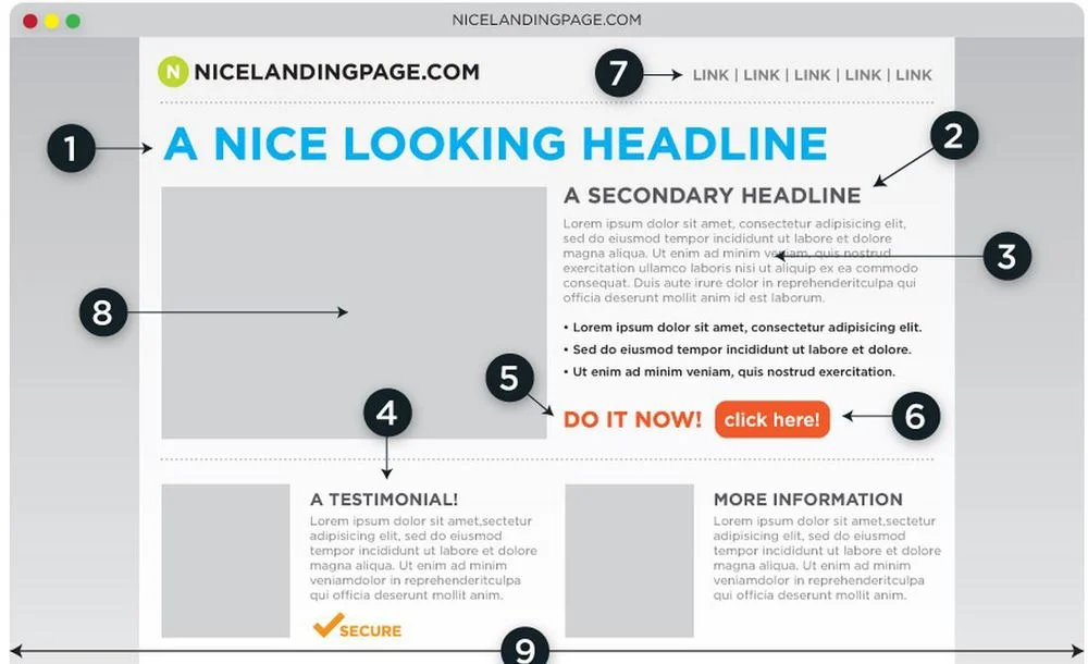
We are programmed to read information from left to right and from high to low which means the most important data should be placed in the top left corner or the bottom right (the primacy and recency effect). There should then be enough white space between these items to ensure they are clearly differentiated.
Looking for Patterns
Another consideration when plotting the visual layout of a page is the amount of spacing between certain elements. As pattern seeking creatures, humans will naturally link elements with similar levels of space between them. For example, two lines of text with the same distance between them will be seen as partners of each other. In contrast, a headline with wider than normal spacing will be seen as separate and, therefore, more significant than the text around it.
Creating a visual layout is pointless if the information doesn’t flow. Users need to be engaged at all times and if their eyes are allowed to wander in open space without any clear direction then you risk losing their attention and their business.
A good example of use of negative space is the homepage of Envato Tuts+. Using different element sizes and utilizing negative space, the layout invites each visitor to focus on the elements that interests them the most, without becoming overwhelmed with information.
Putting Theory into Practice
One team of designers that has a masterful grip on the balance between image and space is UK-based Future&Co. The company has worked with a number of brands, including Lidl, BBC and Virgin, to create a more engaging online experience across all platforms. In a time when seamless cross-platform integration is crucial, Future&Co has focused on creating sites that are as effective in full form (desktop) as they are in mobile app form.
Striking a balance between detail and space is crucial in the mobile world (due to the limited screen space), so to create a site that works in this medium as well as in desktop mode is no mean feat. As an example of a recent marriage between mobile and desktop platforms, Future&Co was recently responsible for the design of a video poker platform for PokerStars. Online poker operator Poker Stars‘ dedicated TV platform attracts around four million viewers from dozens of countries every month, which meant Future&Co had to design a site that was instantly intuitive.
The biggest task for the developers was how to arrange a library of more than 20,000 in such a way that users could easily find what they were looking for. The first thing you will notice when you navigate to the page is that there is a large amount of white space and only a small number of videos. Offering up a small selection of video highlights not only prevents the page from becoming too cluttered but it entices people to engage with the site.
From Mobile to Desktop
Through a combination of tabs and scrolling menus, users can access a constant stream of videos without feeling overwhelmed or lost. In fact, when you look at the interface carefully, the overall structure has a very mobile feel to it and that makes the transition to the app world a lot easier. Instead of reverse engineering a desktop site to work in the mobile world, companies such as Future&Co are now taking mobile concepts and building them into their desktop designs.
This trait can also be seen in some of the company’s other projects, such as Xact Expat. The medial insurance brand tasked Future&Co with creating a site that was able to stand out in a crowded market. Focusing on authority and readability, the site has been optimized for desktop, tablet and mobile platforms and contains a lot of white space. In line with the idea that the important pieces of information should be at the top and bottom of the page, the “quote button” is in a space of its own on the bottom right of the page.
Visuals = Conversions
The end goal for every webmaster is to attract users and then convert those users into customers. Whether it is selling a product, promoting your services or creating leads, a site needs to have a clear path to an end goal. Having a solid overall design is crucial in achieving this aim and that is why the visual layout of a site is so important.